What Are Stock Charts and Why Are They Essential for Every Investor?
At its core, a stock chart is a graphical representation of a security’s price movements over a specific period. It visualizes the historical journey of an asset, plotting its price against time. While this might sound simple, the information embedded within these visual histories is incredibly rich, offering insights into market sentiment, supply and demand dynamics, and potential future price trajectories. Think of a stock chart as a storyteller, recounting the battles between buyers and sellers, the moments of decisive action, and periods of indecision.
The primary purpose of stock charts is to enable investors and traders to identify patterns and trends that can inform their trading strategies. By observing how a stock has behaved in the past under similar conditions, one can make educated guesses about its potential future movements. This isn’t about predicting the future with certainty, but rather about assessing probabilities and managing risk. For instance, recognizing a consistent support level on a chart can indicate a price point where buying interest historically outweighs selling pressure, suggesting a potential entry point for a long position.
Why are these charts so essential for every investor, from those just learning How To Start Investing Little Money 2026 to experienced fund managers?
- Visual Comprehension: Charts translate numerical data into an intuitive visual format, making it easier to grasp complex price action at a glance. Instead of sifting through spreadsheets of closing prices, a chart immediately shows peaks, troughs, and overall direction.
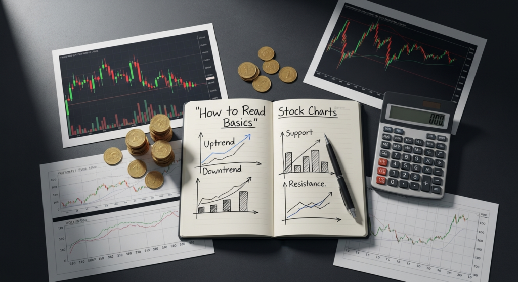
- Trend Identification: They help in quickly identifying whether a stock is in an uptrend, downtrend, or consolidating sideways. Understanding the prevailing trend is crucial for aligning your trades with the market’s momentum.
- Timing Entries and Exits: By analyzing specific price patterns and indicators, charts assist in determining opportune moments to buy or sell a security, optimizing potential profits and minimizing losses.
- Risk Management: Charts are indispensable for setting stop-loss orders and profit targets. Identifying key support and resistance levels allows investors to define their risk parameters clearly, preventing significant capital erosion.
- Market Sentiment Gauging: The shape and movement of candles or bars, coupled with trading volume, can offer clues about the prevailing psychological state of the market participants – whether they are bullish, bearish, or indecisive.
- Adaptability Across Strategies: Whether you’re a day trader, swing trader, or a long-term investor, stock charts provide valuable insights. While a day trader might focus on minute-by-minute charts, a long-term investor might examine weekly or monthly charts to identify overarching trends. Even for those focused on Impact Investing ESG Guide 2026 principles, understanding price action via charts helps in optimizing the financial returns of their ethically aligned investments.
In essence, stock charts are the language of the markets. Learning to read them is akin to learning a new language that unlocks a deeper understanding of financial assets, making you a more confident and strategic participant in the investment landscape.
The Anatomy of a Stock Chart: Price, Time, and Volume
Before diving into specific chart types or complex patterns, it’s crucial to understand the fundamental components that make up virtually every stock chart. These elements provide the raw data from which all analysis stems: price, time, and volume.
The X-Axis: Time
The horizontal axis, or the X-axis, represents time. This is where you select the timeframe for your analysis. The choice of timeframe is critical as it dictates the granularity of the information displayed and heavily influences the type of trading or investing strategy you employ.
- Intraday Charts: These show price movements within a single trading day. Common intervals include 1-minute, 5-minute, 15-minute, or 60-minute charts. Day traders, who open and close positions within the same day, primarily use these shorter timeframes to capture small price fluctuations.
- Daily Charts: Each point, bar, or candle on a daily chart represents one full trading day. These are popular among swing traders and short-term investors who hold positions for a few days to several weeks.
- Weekly Charts: Each unit represents one week of trading activity. Weekly charts are excellent for identifying intermediate-term trends and filtering out the daily noise that can be distracting for longer-term strategies.
- Monthly Charts: Each unit represents one month. These are typically used by long-term investors to analyze major trends and historical context over several years, helping to understand the big picture.
The key takeaway here is that different timeframes reveal different trends. A stock might be in an uptrend on a daily chart but a downtrend on an hourly chart, or vice-versa. Successful analysis often involves looking at multiple timeframes – a concept known as multi-timeframe analysis – to gain a comprehensive perspective.
The Y-Axis: Price
The vertical axis, or the Y-axis, represents the price of the security. Depending on the chart type, this axis will display various price points within a given time interval. For most charts, particularly bar and candlestick charts, four key price points are recorded for each time interval:
- Open Price: The price at which the first trade took place during the specific time interval.
- High Price: The highest price reached by the security during the specific time interval.
- Low Price: The lowest price reached by the security during the specific time interval.
- Close Price: The price at which the last trade took place during the specific time interval. This is often considered the most important price point as it reflects the market’s consensus on the value of the security at the end of the period.
These four price points (OHLC) tell a concise story about the price action within each interval. They show the range of volatility (high minus low), the opening sentiment, and the closing sentiment, which collectively indicate the strength of buyers and sellers.
Volume: The Fuel of Price Movement
Trading volume is often displayed as a separate indicator, typically below the main price chart, represented by vertical bars. Volume measures the total number of shares or contracts of a security that were traded during a specific time interval.
Volume is a critical component of chart analysis because it confirms the strength or weakness of price movements. Think of price as the destination and volume as the fuel.
- High Volume: When price movements occur on high volume, it suggests strong conviction behind that movement. A significant price increase on high volume indicates strong buying interest, making the move more reliable. Conversely, a sharp price drop on high volume indicates strong selling pressure.
- Low Volume: Price movements on low volume are generally less reliable and may indicate a lack of conviction from market participants. A price surge on low volume might be a “head fake,” as there isn’t broad participation to sustain the move. Similarly, a minor price drop on low volume might not be a significant concern.
- Volume Spikes: Sudden spikes in volume often accompany significant news events, breakouts from consolidation patterns, or reversals in trends. These can be important signals that a major shift in supply and demand is occurring.
Always consider volume in conjunction with price action. A strong trend should ideally be accompanied by increasing volume in the direction of the trend and decreasing volume during pullbacks. Ignoring volume is a common pitfall for new traders, as it deprives them of a crucial piece of the market puzzle. Understanding these basic components lays the groundwork for interpreting the various visual representations of price action.
Understanding Different Chart Types: Line, Bar, and Candlestick Charts
Line Charts: The Simplicity of Closing Prices
The line chart is the simplest form of a stock chart. It connects a series of closing prices over a given timeframe with a continuous line.
- What it shows: Primarily, the closing price for each interval.
-
Advantages:
- Extremely clean and easy to read, making it ideal for beginners.
- Excellent for visualizing long-term trends and overall price direction.
- Reduces market noise by focusing solely on the closing price, which is often considered the most significant price point.
-
Disadvantages:
- Lacks the detail of intraday price movements (open, high, low). You can’t see the volatility or price range within each period.
- Less useful for short-term trading strategies that require precise entry and exit points.
Line charts are great for getting a quick overview of a stock’s trajectory, especially when comparing multiple stocks or analyzing broad market indices.
Bar Charts: The OHLC Story
Bar charts, also known as OHLC (Open, High, Low, Close) charts, provide more detail than line charts by displaying all four key price points for each period. Each vertical bar represents a single trading period (e.g., a day, an hour).
-
What it shows:
- The top of the vertical bar indicates the high price.
- The bottom of the vertical bar indicates the low price.
- A horizontal tick extending to the left of the bar signifies the open price.
- A horizontal tick extending to the right of the bar signifies the close price.
-
Advantages:
- Provides a comprehensive view of price action within each period, including the trading range and the relationship between open and close.
- Better for identifying volatility and price reversals compared to line charts.
- Offers a good balance between simplicity and detail.
-
Disadvantages:
- Can appear cluttered compared to line charts, especially for those new to charting.
- Less visually intuitive than candlestick charts for quickly discerning bullish or bearish sentiment.
Bar charts are a solid choice for those who need more information than a line chart provides but find candlestick charts a bit too complex initially.
Candlestick Charts: The Visual Powerhouse
Originating from 18th-century Japanese rice traders, candlestick charts are by far the most popular and visually rich chart type used by modern traders. Each “candlestick” represents the OHLC prices for a specific period, but in a much more intuitive and colorful format.
-
What it shows:
- The Real Body: The rectangular part of the candlestick, representing the range between the open and close prices.
- The Wicks (or Shadows): The thin lines extending above and below the real body, indicating the high and low prices for the period. The top of the upper wick is the high, and the bottom of the lower wick is the low.
- Color: The color of the real body typically signifies whether the price closed higher or lower than it opened.
- Green or White Candle (Bullish): The close price was higher than the open price. This indicates that buyers were in control during that period.
- Red or Black Candle (Bearish): The close price was lower than the open price. This indicates that sellers were in control during that period.
-
Advantages:
- Highly Visual: The colors and shapes make it incredibly easy to grasp market sentiment at a glance. A long green body immediately screams strong buying pressure.
- Rich Information: Conveys all four OHLC prices plus the relationship between open and close, and the overall range and volatility.
- Pattern Recognition: The unique shapes of individual candlesticks and combinations of candlesticks form recognizable patterns that often signal potential reversals or continuations of trends. This makes them invaluable for technical analysis.
-
Disadvantages:
- Can be overwhelming for absolute beginners due to the amount of information in each candle.
- Requires practice to learn the various candlestick patterns and their implications.
For anyone serious about learning how to read stock charts, mastering candlestick charts is highly recommended. Their visual efficiency and the wealth of information they convey make them an indispensable tool for technical analysis.
Key Chart Elements and Indicators for Beginners
Once you understand the basic anatomy and types of charts, the next step is to identify key elements and introduce simple indicators that help interpret price action and make predictions. These tools provide context and confirmation, allowing you to build a more robust analytical framework.
Support and Resistance Levels
Support and resistance are fundamental concepts in technical analysis. They represent price levels where a stock’s price tends to pause, reverse, or consolidate due to a concentration of buying or selling interest.
- Support: A price level where buying interest is strong enough to prevent the price from falling further. It acts as a “floor.” When a stock price approaches a support level, demand tends to increase, pushing the price back up. Historically, previous lows often become support levels.
- Resistance: A price level where selling interest is strong enough to prevent the price from rising further. It acts as a “ceiling.” When a stock price approaches a resistance level, supply tends to increase, pushing the price back down. Historically, previous highs often become resistance levels.
The Psychology Behind S&R: These levels are often self-fulfilling prophecies. Traders remember where prices reversed in the past and tend to make similar decisions when prices approach those levels again.
How to Identify: Look for areas on the chart where the price has repeatedly stopped, reversed, or struggled to break through. You can draw horizontal lines connecting these points.
Significance:
- They provide potential entry and exit points.
- A break above resistance (or below support) on high volume can signal a significant shift in market sentiment and the potential for a new trend.
- Often, a broken resistance level can turn into a new support level, and vice-versa.
Trends and Trendlines
Trends describe the general direction of a stock’s price movement over time. Identifying trends is one of the most basic and crucial aspects of chart analysis.
- Uptrend (Bullish Trend): Characterized by a series of higher highs and higher lows. Buyers are in control, and the price is generally moving upwards.
- Downtrend (Bearish Trend): Characterized by a series of lower highs and lower lows. Sellers are in control, and the price is generally moving downwards.
- Sideways Trend (Consolidation/Range-bound): When a stock’s price moves within a relatively narrow range, without a clear upward or downward direction. This often precedes a breakout in either direction.
Trendlines: These are lines drawn on a chart connecting significant highs or lows to visualize and identify the direction and strength of a trend.
- Uptrend Line: Drawn by connecting two or more successive higher lows. This line acts as dynamic support.
- Downtrend Line: Drawn by connecting two or more successive lower highs. This line acts as dynamic resistance.
A break of a trendline can signal a potential reversal or weakening of the current trend.
Moving Averages (MAs)
Moving Averages are widely used technical indicators that smooth out price data by creating a constantly updated average price. They help to identify trend direction, potential support/resistance, and momentum.
- Simple Moving Average (SMA): Calculates the average price of a security over a specified number of periods. For example, a 50-day SMA calculates the average closing price over the last 50 trading days.
- Exponential Moving Average (EMA): Similar to SMA, but it gives more weight to recent price data, making it more responsive to new information.
How to use them:
- Trend Identification: If the price is consistently above a moving average, it suggests an uptrend. If it’s consistently below, it suggests a downtrend.
- Dynamic Support/Resistance: Moving averages can act as dynamic support (in an uptrend) or resistance (in a downtrend), meaning these levels move with the price.
- Crossovers: The crossing of two different moving averages can generate buy or sell signals. For instance, a “Golden Cross” (when a shorter-term MA crosses above a longer-term MA, like the 50-day SMA crossing above the 200-day SMA) is often seen as a bullish signal. A “Death Cross” (the opposite) is seen as bearish.
Common periods for MAs include 20, 50, 100, and 200 days, depending on the investor’s timeframe. For investors looking into Impact Investing ESG Guide 2026, moving averages can still be useful for timing entries into fundamentally strong companies, even if their primary focus is long-term value and ethical considerations.
Volume Confirmation
While discussed previously, it bears repeating: volume is an indicator in its own right and a crucial confirmation tool.
- Confirming Trends: A strong uptrend should ideally see increasing volume on upward price moves and decreasing volume on pullbacks. Similarly, a strong downtrend should have increasing volume on downward moves.
- Confirming Breakouts: A significant price breakout above resistance or below support is more reliable if accompanied by a substantial increase in volume. This indicates strong conviction from market participants.
- Warning of Reversals: If a stock is making new highs but on declining volume, it can signal that the trend is losing momentum and a reversal might be imminent.
By combining these basic elements – support/resistance, trends, moving averages, and volume – even a beginner can start to build a clearer picture of market dynamics and make more educated trading decisions.
Reading Candlestick Patterns: The Language of Price Action
Candlestick charts are not just aesthetically pleasing; they are rich with information, and individual candlesticks or combinations of a few candles form recognizable patterns that tell a story about market sentiment. These patterns can often signal potential price reversals or continuations, providing valuable insights for traders. While there are dozens of patterns, focusing on a few key ones will give beginners a powerful toolset.
Understanding the Basics of a Candlestick
Recall that each candlestick has a ‘real body’ (the difference between open and close) and ‘wicks’ or ‘shadows’ (the high and low).
- Long Green/White Body: Strong buying pressure, closing significantly higher than opening.
- Long Red/Black Body: Strong selling pressure, closing significantly lower than opening.
- Small Body: Indicates indecision or a struggle between buyers and sellers, with little net movement.
- Long Wicks: Show that price moved significantly in that direction but was rejected, indicating volatility and potential reversal.
- Short Wicks: Price stayed close to the open/close, indicating less volatility or strong directional conviction.
Key Bullish Reversal Patterns (Often seen at the bottom of a downtrend)
These patterns suggest that a downtrend may be coming to an end and a reversal to an uptrend is likely.
-
Hammer:
- Appearance: Small real body (green or red) with a long lower wick (at least twice the length of the body) and little to no upper wick.
- Interpretation: Occurs after a downtrend. During the period, sellers pushed the price down significantly (long lower wick), but buyers stepped in forcefully to push the price back up, often closing near the open or even higher. This shows strong buying interest and rejection of lower prices.
-
Bullish Engulfing:
- Appearance: A small red candle is completely engulfed by a large green candle that follows it.
- Interpretation: The sellers’ momentum from the previous period (small red candle) is completely overwhelmed by a surge in buying pressure in the next period (large green candle). This is a strong reversal signal, as buyers have seized control.
-
Morning Star:
- Appearance: A three-candle pattern. A long red candle, followed by a small-bodied candle (could be green or red, often a Doji or spinning top) that gaps down, and then a long green candle that gaps up and closes well into the body of the first red candle.
- Interpretation: The first red candle confirms the downtrend. The second small candle shows indecision and exhaustion of sellers. The third green candle signifies strong buyer resurgence, confirming the reversal.
Key Bearish Reversal Patterns (Often seen at the top of an uptrend)
These patterns suggest that an uptrend may be losing steam and a reversal to a downtrend is likely.
-
Hanging Man:
- Appearance: Identical in shape to a Hammer (small body, long lower wick, little upper wick), but it appears after an uptrend.
- Interpretation: Although buyers pushed prices up, strong selling pressure emerged during the period, pushing prices down before buyers could recover some ground. This indicates that sellers are entering the market and the uptrend might be losing momentum.
-
Bearish Engulfing:
- Appearance: A small green candle is completely engulfed by a large red candle that follows it.
- Interpretation: The buyers’ momentum from the previous period (small green candle) is completely overwhelmed by a surge in selling pressure in the next period (large red candle). A strong reversal signal, as sellers have taken control.
-
Evening Star:
- Appearance: A three-candle pattern. A long green candle, followed by a small-bodied candle (could be green or red, often a Doji or spinning top) that gaps up, and then a long red candle that gaps down and closes well into the body of the first green candle.
- Interpretation: The first green candle confirms the uptrend. The second small candle shows indecision and exhaustion of buyers. The third red candle signifies strong seller resurgence, confirming the reversal.
Indecision and Continuation Patterns
-
Doji:
- Appearance: Open and close prices are virtually the same, forming a cross or plus sign. The real body is extremely small or non-existent, while wicks can vary in length.
- Interpretation: Represents indecision in the market. Neither buyers nor sellers were able to gain control. While often associated with reversals when appearing after a strong trend, a Doji can also signify consolidation.
-
Spinning Top:
- Appearance: Small real body (green or red) with relatively long upper and lower wicks.
- Interpretation: Also signifies indecision, similar to a Doji but with a slightly larger body. It suggests that despite significant price movement during the period, buyers and sellers balanced each other out, leading to a close near the open.
Important Note on Patterns: Candlestick patterns are most effective when viewed in context. A Hammer in an uptrend has a different implication than a Hammer at the bottom of a downtrend. Always look for confirmation from subsequent candles, volume, and
Recommended Resources
Related reading: Startup Marketing On A Budget (Page Release).
You might also enjoy What Is Enterprise Resource Planning (Erp) For Smbs from Kacerr.