The Foundation: Understanding the Cartesian Coordinate System
At its heart, a line chart is built upon the principles of the Cartesian coordinate system, a mathematical framework that allows us to plot points in a two-dimensional space. Renowned French philosopher and mathematician René Descartes introduced this system, which forms the bedrock of most data visualization techniques we encounter daily, particularly in finance. For any investor, recognizing this underlying structure is the first step toward mastering chart analysis.
The Cartesian system, as applied to a line chart, consists of two perpendicular axes: the horizontal axis, traditionally known as the X-axis, and the vertical axis, referred to as the Y-axis. These axes intersect at a point called the origin, typically representing a zero value for both dimensions. In the context of financial charts, the X-axis almost invariably represents time, while the Y-axis quantifies a specific value, such as price, volume, or an economic indicator. This pairing of time versus value is what allows line charts to effectively illustrate how something has changed or performed over a given period.
Imagine tracking the closing price of a particular stock, say, a tech giant, over the course of a year. Each day, you record its closing price. To visualize this, you would plot each day’s price as a distinct point on a graph. The X-axis would tick along, representing January 1st, January 2nd, and so on, until December 31st. Simultaneously, the Y-axis would display the stock’s price range, from its lowest point during the year to its highest. By connecting these daily price points, a line emerges, tracing the stock’s journey throughout the year. This fundamental setup is crucial for understanding trends, volatility, and historical performance, providing the visual context necessary for any serious financial analysis in 2026.
Without a clear understanding of how these two axes interact to define data points, interpreting even the simplest line chart can be misleading. It’s the precise mapping of a time-specific event (X-axis) to its corresponding value (Y-axis) that gives the line chart its analytical power. This foundational knowledge is as essential as any of the finance tips you should know for your portfolio, as it underpins your ability to read and react to market data effectively.
The X-Axis: Navigating Time and Periodicity

The X-axis, or the horizontal axis, is arguably the most critical component of a financial line chart, as it invariably represents time. In finance, almost every data point has a timestamp, and understanding the progression of events over time is key to identifying trends, cycles, and significant historical moments. The X-axis provides the temporal context that transforms raw numbers into a meaningful narrative.
The granularity of the X-axis, often referred to as its periodicity or timeframe, can vary significantly depending on the analytical objective. Common timeframes include:
- Intraday: Showing price movements within a single trading day, often broken down by minutes or hours. This is crucial for day traders or those making very short-term decisions.
- Daily: Each data point represents a full trading day (e.g., closing price). This is a standard view for many retail investors tracking daily market movements.
- Weekly: Each data point summarizes a week’s activity. Useful for observing medium-term trends and filtering out daily noise.
- Monthly: Each data point represents a month. Ideal for long-term investors looking at broader trends and cyclical patterns.
- Quarterly/Yearly: Provides a very high-level view, excellent for historical performance analysis, comparing long-term growth, or evaluating the overall trajectory of an investment over several years or decades.
The choice of timeframe for the X-axis profoundly impacts the visual representation of the data and, consequently, the conclusions one might draw. A stock that appears highly volatile on a daily chart might show a steady upward trend on a monthly or yearly chart. For instance, if you are planning to hold an investment for a decade, focusing solely on daily fluctuations might lead to unnecessary stress and poor decisions. Conversely, ignoring daily movements for a short-term trade would be equally detrimental.
Furthermore, the X-axis often includes labels indicating specific dates or periods, such as “Jan 2023,” “Q3 2024,” or “2025.” These labels provide crucial reference points, allowing investors to pinpoint specific events or compare performance across different periods. When you are trying to juggle multiple financial projects, such as planning for retirement, saving for a down payment, and managing a short-term trading account, understanding how to adjust the X-axis timeframe becomes an invaluable skill. Each project likely demands a different temporal perspective, and being able to switch between them efficiently on a chart aids in strategic planning and execution.
Ultimately, the X-axis is more than just a timeline; it’s a strategic lens through which investors can observe the unfolding story of financial assets, calibrate their analysis to their investment horizon, and make decisions that align with their long-term or short-term objectives.
The Y-Axis: Quantifying Value and Scale
Common values represented on the Y-axis in financial charts include:
- Price: The most common application, showing the monetary value of an asset (e.g., stock price in dollars, commodity price per barrel).
- Volume: The number of shares or contracts traded during a specific period, often displayed in a separate sub-chart below the main price chart. This indicates market activity and liquidity.
- Percentage Change: Useful for comparing the relative performance of different assets, regardless of their absolute price.
- Index Value: For market indices like the S&P 500 or NASDAQ Composite.
- Interest Rates: For bond markets or economic indicators.
- Indicator Values: Values generated by technical indicators (e.g., RSI, MACD), often plotted in separate panels.
One of the most important aspects of the Y-axis is its scaling. There are primarily two types of scales used in financial charting:
- Linear Scale: This is the default and most straightforward scale, where equal distances on the axis represent equal absolute changes in value. For example, the distance between $10 and $20 is the same as the distance between $100 and $110. Linear scales are excellent for showing absolute price movements and are generally preferred for shorter timeframes or when the price range is relatively small.
- Logarithmic (Log) Scale: In a logarithmic scale, equal distances on the axis represent equal percentage changes. For instance, the distance between $10 and $20 (a 100% increase) would be the same as the distance between $100 and $200 (also a 100% increase). Log scales are particularly useful for:
- Long-term charts: When analyzing assets that have seen significant appreciation over decades (e.g., growth stocks like Amazon or Apple), a linear scale can compress early growth, making it appear flat. A log scale accurately depicts percentage gains over time.
- Comparing assets with vastly different price points: It allows for a more equitable comparison of growth rates.
- Identifying percentage-based trends: Such as exponential growth or consistent percentage decline.
The choice between a linear and logarithmic scale can dramatically alter the visual perception of a trend. A seemingly modest gain on a linear scale might reveal itself as a significant percentage increase on a log scale, or vice-versa. Understanding this distinction is crucial for accurate analysis and avoiding visual deception. It’s a critical component of the finance tips you should know for your portfolio, as misinterpreting scale can lead to flawed investment decisions.
Labels along the Y-axis clearly indicate the values, often accompanied by units (e.g., $, %, etc.). These labels ensure that the viewer can precisely determine the value of any point on the chart. Without properly labeled and scaled Y-axes, a line chart is merely a collection of lines, devoid of the specific financial context that makes it a powerful analytical tool.
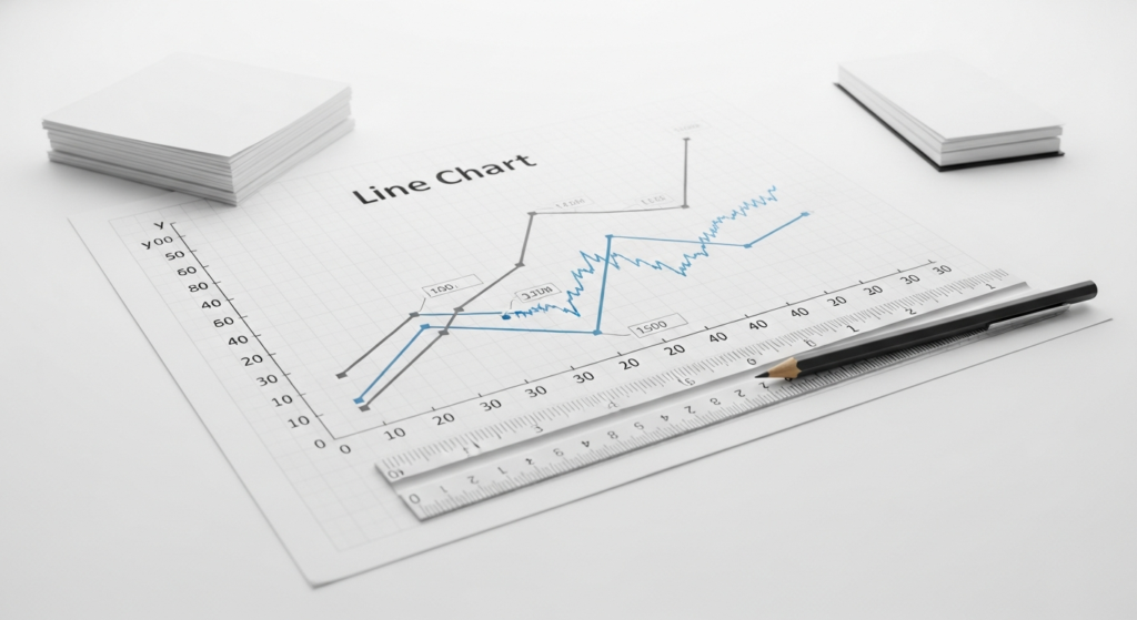
The Data Points and The Line Itself: The Storytellers

While the axes provide the framework, the data points and the line connecting them are the true storytellers of a line chart. They represent the actual financial information being visualized, transforming abstract numbers into a coherent and interpretable narrative of market behavior.
Data Points: Each individual point on a line chart represents a specific observation at a particular point in time. For example, on a daily stock price chart, each data point typically signifies the closing price of the stock on that given day. If it’s an intraday chart, it might be the price at 10:00 AM, 10:01 AM, and so on. These points are the raw ingredients, the fundamental measurements that capture the asset’s value or activity at distinct moments.
The precision and frequency of these data points are determined by the timeframe chosen for the X-axis. A chart with more frequent data points (e.g., hourly vs. daily) will appear more detailed and jagged, reflecting short-term fluctuations. A chart with less frequent data points will smooth out these fluctuations, highlighting broader trends.
The Line Itself: The line in a line chart is formed by connecting sequential data points. This continuous connection is what gives the chart its power, as it visually represents the progression and movement of the data over time. The line is not just a connector; it’s an indicator of trends, momentum, and volatility. By observing the direction, slope, and curvature of the line, investors can glean significant insights:
- Trends: An upward sloping line indicates an uptrend (bullish momentum), a downward sloping line indicates a downtrend (bearish momentum), and a relatively flat or horizontal line suggests a sideways or consolidating market. Identifying these trends is fundamental to technical analysis.
- Rate of Change (Slope): The steeper the slope of the line, the faster the rate of change in value. A sharp upward slope means rapid appreciation, while a sharp downward slope indicates a swift decline.
- Volatility: A line that exhibits frequent, sharp peaks and troughs suggests high volatility, meaning the price is fluctuating significantly. A smoother, less erratic line indicates lower volatility.
- Support and Resistance: Over time, the line might repeatedly bounce off certain price levels (support) or struggle to break above others (resistance). These levels, formed by the historical path of the line, are key concepts for traders looking for entry and exit points.
- Patterns: Various chart patterns (e.g., head and shoulders, double top/bottom) are formed by the specific contours of the line, which analysts use to forecast future price movements.
The line can also represent derived data, such as moving averages. A moving average is a smoothed line calculated by taking the average of prices over a specific period (e.g., 50-day moving average). These lines help to filter out noise and highlight underlying trends more clearly. When multiple lines are plotted on the same chart (e.g., comparing two stocks, or a stock against an index), their relative positions and movements become a powerful comparative tool.
Understanding the interplay between discrete data points and the continuous line they form is vital for interpreting market sentiment and making informed trading decisions. It’s how investors can identify potential easy ways to save big on expensive purchases, by timing their entry into an investment when the line indicates a favorable price point, or conversely, exiting to protect gains.
Essential Auxiliary Components for Enhanced Analysis
While the axes, data points, and the connecting line form the core of any line chart, several auxiliary components significantly enhance its readability, context, and analytical utility. These elements provide additional layers of information, making the chart more comprehensive and easier to understand for investors of all experience levels.
1. Chart Title/Header: Every effective line chart should have a clear and concise title. The title immediately informs the viewer about what the chart is depicting (e.g., “Apple Inc. (AAPL) Closing Price – Daily,” or “S&P 500 Performance vs. NASDAQ Composite – Monthly”). A good title provides immediate context, preventing misinterpretation and ensuring the focus is on the relevant data. Without a title, a chart is like a book without a cover, its content ambiguous.
2. Legend: When a chart displays multiple lines (e.g., comparing the performance of two different stocks, or plotting a stock’s price alongside a technical indicator like the Relative Strength Index), a legend becomes indispensable. The legend uses different colors, line styles (solid, dashed), or markers to identify which line corresponds to which data series. This prevents confusion and allows for easy differentiation and comparison between various plotted elements. For instance, you might see “Stock A (Blue Line)” and “Stock B (Red Line)” in the legend, making direct comparison straightforward.
3. Axis Labels and Units: Beyond the numerical values, explicit labels for both the X and Y axes are crucial. The X-axis might be labeled “Date,” “Time,” or “Fiscal Year,” while the Y-axis might be labeled “Price (USD),” “Volume (Shares),” or “Percentage Change.” These labels eliminate ambiguity about what quantity or dimension each axis represents, ensuring accurate interpretation of the data. Including units (e.g., $, shares, %) further clarifies the magnitude.
4. Gridlines: Gridlines are faint horizontal and vertical lines that extend from the axis ticks across the plotting area. They act as visual guides, making it easier to read specific values from the axes for any point on the line. Horizontal gridlines help in quickly estimating the Y-axis value, while vertical gridlines aid in pinpointing the X-axis (time) value. While not always strictly necessary, gridlines significantly improve the precision with which one can extract data from a chart, especially when trying to identify exact price levels or dates.
5. Annotations and Markers: These are specific additions to the chart that highlight particular events or points of interest. Annotations might include text boxes indicating earnings reports, dividend payments, stock splits, major news announcements, or significant economic data releases. Markers could be symbols (e.g., stars, triangles) plotted directly on the line to denote specific occurrences. For example, a star might mark the date of a company’s product launch, allowing investors to visually correlate the event with subsequent price action. These elements add narrative depth to the quantitative data, helping investors understand the “why” behind significant price movements.
6. Source and Date: While not always a visual component within the plotting area itself, including the data source (e.g., “Data from Yahoo Finance”) and the date the chart was generated is a mark of good practice. It adds credibility and allows users to verify the data if needed, enhancing trustworthiness in the information presented.
These auxiliary components transform a basic line drawing into a powerful analytical dashboard. They equip retail investors with the necessary tools to not only see trends but also to understand the context and implications of those trends. This comprehensive view is vital for making informed decisions, much like having a full suite of finance tips you should know for your portfolio at your disposal, providing clarity and confidence in a complex market. By paying attention to these details, you enhance your ability to extract actionable intelligence and manage your financial projects more effectively, whether you’re working on short-term trades or long-term wealth accumulation strategies in 2026.
Interpreting Line Charts: Beyond the Basics for Investors
Understanding the components of a line chart is merely the first step; the true skill lies in interpreting what these components collectively communicate. For retail investors and personal finance enthusiasts, moving beyond simply identifying lines and labels to extracting actionable insights is where the real value lies. This involves observing patterns, understanding relationships, and contextualizing the data within broader market dynamics.
1. Trend Identification: The most fundamental interpretation of a line chart is identifying the prevailing trend.
- Uptrend: Characterized by a series of higher highs and higher lows. This suggests bullish sentiment and potential for further price appreciation.
- Downtrend: Indicated by a series of lower highs and lower lows. This points to bearish sentiment and potential for further declines.
- Sideways/Consolidation: When the line moves horizontally within a defined range, showing no clear upward or downward direction. This often precedes a breakout or breakdown.
Identifying trends helps investors align their strategies – buying into uptrends, considering short positions or avoiding downtrends, and exercising caution during sideways movements. This ties directly into finance tips you should know for your portfolio, as trend following is a core strategy for many successful investors.
2. Support and Resistance Levels: These are price levels where the asset has historically struggled to move beyond.
- Support: A price level where buying interest is strong enough to prevent the price from falling further. The line tends to bounce off this level.
- Resistance: A price level where selling pressure is strong enough to prevent the price from rising higher. The line tends to pull back from this level.
Recognizing these levels on a line chart provides crucial insights into potential turning points. Traders use them to set entry and exit points, stop-loss orders, and take-profit targets. For long-term investors, understanding support can indicate good accumulation zones, while resistance might suggest areas to trim positions or exercise caution.
3. Volume Analysis (often a sub-chart): While not strictly part of the main price line, volume is almost always presented in conjunction with line charts, typically as a bar chart below the price action.
- High Volume on Price Movements: A strong price movement (up or down) accompanied by high volume suggests conviction behind that move.
- Low Volume on Price Movements: A price movement on low volume might indicate weakness or lack of conviction, making it less reliable.
- Volume Spikes: Can signal significant events, institutional activity, or potential reversals.
Combining price line analysis with volume provides a more robust understanding of market strength and potential future direction. It’s a key component of analyzing market depth and interest.
4. Relative Strength Comparisons: By plotting multiple lines on the same chart (e.g., a stock versus its sector index, or two competing companies), investors can perform relative strength analysis. This helps determine which asset is outperforming or underperforming. For example, if your chosen stock’s line is consistently rising faster than the overall market index’s line, it indicates relative strength. This comparison is vital for portfolio construction and ensuring you are investing in leading assets within their respective categories, which can be a strategic move to save big on expensive purchases if you consider “buying” a high-performing asset as a smart purchase.
5. Identifying Chart Patterns: The specific shapes and formations created by the line over time can form recognized chart patterns that technical analysts use to predict future movements. Examples include:
- Double Tops/Bottoms: Reversal patterns indicating a potential change in trend.
- Triangles (Ascending, Descending, Symmetrical): Continuation or reversal patterns, often preceding significant breakouts.
- Flags/Pennants: Short-term continuation patterns that represent brief pauses in a strong trend.
Learning to identify these patterns requires practice but can offer powerful predictive insights, helping investors to anticipate market shifts and manage their risk exposure across multiple financial projects.
6. Combining with Other Indicators: While line charts are powerful, they are often used in conjunction with other technical indicators (e.g., moving averages, Relative Strength Index (RSI), Moving Average Convergence Divergence (MACD)) for a more holistic view. A line chart shows you what is happening with the price, while indicators can help explain the momentum or overbought/oversold conditions. This multi-faceted approach enhances decision-making and reduces reliance on a single data point.
In 2026, the ability to interpret line charts effectively remains a cornerstone of informed investing. It empowers retail investors to move beyond speculative guesses, allowing them to make data-driven decisions that align with their financial goals and risk tolerance. By understanding the intricate dance between each component and what they collectively signify, you transform a simple graph into a powerful tool for financial success.
Frequently Asked Questions
Recommended Resources
Check out High Yield Savings Account Vs Regular Savings Account on Fin3go for a deeper dive.
Check out What Is Servant Leadership And How To Practice It on AssetBar for a deeper dive.