Mastering the Visual Language: A Comprehensive Guide to Reading Stock Charts
In the dynamic world of financial markets, information is power. While fundamental analysis delves into a company’s intrinsic value, technical analysis offers a distinct, equally crucial lens: the stock chart. For investors and traders alike, understanding how to read these visual representations of price action is akin to deciphering the market’s heartbeat. It’s a skill that can illuminate trends, identify potential reversal points, and ultimately inform more strategic entry and exit decisions. At TradingCosts, we believe in empowering our readers with data-driven insights, and in this comprehensive guide, we’ll demystify the art and science of stock chart interpretation, transforming complex visual data into actionable intelligence for your portfolio.
Whether you’re a long-term investor seeking optimal entry points or a short-term trader navigating intraday volatility, proficiency in chart analysis can significantly enhance your decision-making framework. While no method guarantees future performance—the S&P 500, for instance, has delivered an average annual return of approximately 10-12% over the long term, but with significant short-term fluctuations—technical analysis provides a probabilistic edge by revealing patterns of collective market psychology. Let’s embark on this journey to decode the market’s visual language.
Understanding the Foundation: What is a Stock Chart?
At its core, a stock chart is a graphical representation of a security’s price movements over a specific period. It condenses vast amounts of data—open, high, low, and close prices, alongside trading volume—into an easily digestible format. The primary purpose is to identify patterns and trends that can suggest future price direction, based on the premise that history, or at least human behavior, tends to repeat itself in the markets.
Timeframes: The Lens of Analysis
One of the first decisions an analyst makes is selecting the appropriate timeframe, which dictates the level of detail and the investment horizon. Common timeframes include:
- Intraday Charts: Ranging from 1-minute to 60-minute intervals, these are favored by day traders and scalpers for identifying rapid price fluctuations.
- Daily Charts: Each point or candle represents one trading day. These are popular for swing traders and short-to-medium term investors.
- Weekly Charts: Each point or candle covers one week. These provide a broader perspective, often used by medium-term investors to identify significant trends.
- Monthly/Yearly Charts: These offer the longest-term view, ideal for long-term investors and those seeking to understand macroeconomic trends impacting a stock over decades.
The choice of timeframe is crucial and often depends on your trading strategy and risk tolerance. A long-term investor focused on compounding wealth over 10-20 years, aiming for returns perhaps mirroring the historical average of the Dow Jones Industrial Average (around 8-10% annually over the last century), would likely prioritize weekly and monthly charts, while a day trader might focus exclusively on 5-minute charts.
Types of Charts: Visualizing Price Action
While several chart types exist, three are most prevalent:
- Line Charts: The simplest form, connecting only the closing prices over time. They offer a clear view of overall trends but lack detailed price action within each period.
- Bar Charts: Each bar represents a period (e.g., one day) and shows the open, high, low, and close prices. The vertical line indicates the high-low range, a small horizontal dash on the left marks the open, and a dash on the right marks the close.
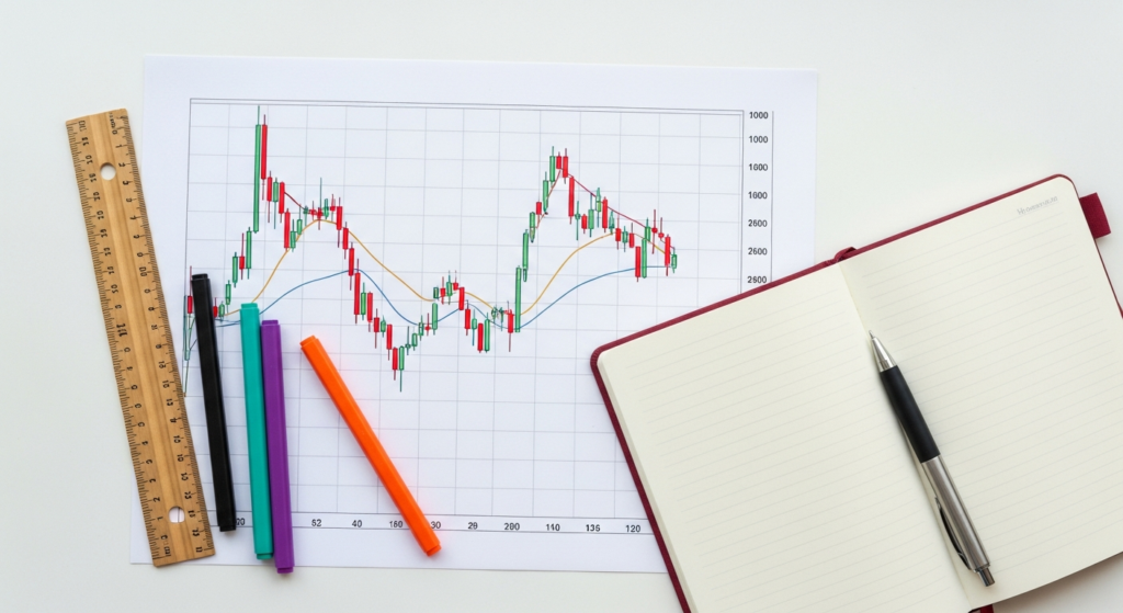
- Candlestick Charts: Developed in 18th-century Japan by rice traders, these are arguably the most popular and informative. Each “candlestick” provides a vivid visual summary of price action within a given timeframe, making them invaluable for technical analysts. We will focus primarily on candlestick charts due to their widespread utility.
Deconstructing Candlestick Charts: The Language of Price Action
Candlestick charts are the preferred tool for many professional traders and analysts because they convey a wealth of information at a glance. Each candlestick tells a story about the battle between buyers (bulls) and sellers (bears) during its specific timeframe.
Anatomy of a Candlestick
Every candlestick has two main parts:
- The Body: This rectangular part represents the range between the opening and closing prices.
- The Wicks (or Shadows): These thin lines extending above and below the body indicate the highest and lowest prices reached during the period. The top of the upper wick is the “high,” and the bottom of the lower wick is the “low.”
Bullish vs. Bearish Candlesticks
The color of the candlestick body is critical:
- Bullish Candlestick (Typically Green or White): Indicates that the closing price was higher than the opening price. A strong green body suggests significant buying pressure. The bottom of the body is the open, and the top is the close.
- Bearish Candlestick (Typically Red or Black): Indicates that the closing price was lower than the opening price. A strong red body suggests significant selling pressure. The top of the body is the open, and the bottom is the close.
For example, if a stock opened at $100 and closed at $105, with a high of $106 and a low of $99, it would form a green candlestick. If it opened at $105 and closed at $100, with a high of $106 and a low of $99, it would form a red candlestick.
Basic Single Candlestick Patterns
Even individual candlesticks can offer insights:
- Doji: A very small or non-existent body, where the open and close prices are nearly identical. This suggests indecision in the market, with neither buyers nor sellers gaining control. Often indicates a potential reversal, especially after a strong trend.
- Hammer/Hanging Man: A small body near the top of the range with a long lower wick (at least twice the length of the body) and little to no upper wick. A “Hammer” occurring after a downtrend is bullish, suggesting buyers stepped in to push prices up from the lows. A “Hanging Man” after an uptrend is bearish, signaling potential selling pressure.
- Inverted Hammer/Shooting Star: A small body near the bottom of the range with a long upper wick and little to no lower wick. An “Inverted Hammer” after a downtrend is bullish. A “Shooting Star” after an uptrend is bearish, indicating sellers rejected higher prices.
- Marubozu: A candlestick with no wicks, meaning the open was the low (bullish) or the high (bearish), and the close was the high (bullish) or the low (bearish). A strong Marubozu indicates overwhelming conviction in one direction.
These basic patterns are building blocks. While a single candlestick rarely dictates a trading decision, it provides context and hints at the prevailing market sentiment.
Key Chart Components and Indicators for Analysis
Beyond individual candlesticks, comprehensive chart analysis involves incorporating various components and technical indicators that provide deeper insights into market dynamics. Platforms like TradingView, E*TRADE Pro, Fidelity Active Trader Pro, and Interactive Brokers Trader Workstation (TWS) offer robust charting tools with a wide array of these indicators.
1. Volume: The Fuel of Price Action
Volume represents the number of shares traded during a specific period. It’s often displayed as a bar graph below the price chart. Volume confirms the strength of a price move:
- High Volume with Price Movement: Suggests strong conviction behind the move. A significant price increase on high volume is generally more sustainable than one on low volume.
- Low Volume with Price Movement: Indicates a lack of conviction. A price rally on low volume might be weak and prone to reversal.
- Volume Spikes: Can signal major news, institutional activity, or a turning point in the market.
For instance, if a stock like Apple (AAPL) breaks above a key resistance level on significantly higher-than-average volume, it’s a stronger signal than a breakout on low volume, which might be a “false breakout.”
2. Support & Resistance: The Market’s Floor and Ceiling
Support and resistance levels are psychological price barriers where buying or selling pressure is expected to be strong enough to prevent the price from moving further in a particular direction:
-
Support: A price level where a downtrend is expected to pause due to concentrated buying interest. Historically, when a stock price falls to a support level, buyers tend to step in, preventing further declines. Think of it as a “floor.”
-
Resistance: A price level where an uptrend is expected to pause due to concentrated selling interest. When a stock price rises to a resistance level, sellers tend to emerge, preventing further advances. Think of it as a “ceiling.”
These levels are often identified by previous highs or lows, or by areas where price has repeatedly struggled to break through. When a support or resistance level is decisively broken (especially on high volume), it often reverses its role—former resistance becomes new support, and vice-versa.
3. Trendlines: Mapping the Direction
Trendlines are straight lines drawn on a chart to connect a series of highs or lows, indicating the prevailing direction of the price. They help visualize the trend and identify potential areas of support or resistance within that trend:
- Uptrend Line: Connects a series of higher lows. Price is expected to bounce off this line.
- Downtrend Line: Connects a series of lower highs. Price is expected to be rejected by this line.
- Sideways Trend (Consolidation): When price moves horizontally, often between clear support and resistance levels.
The longer and more frequently a trendline is respected, the stronger its significance. A break of a significant trendline can signal a potential trend reversal.
4. Moving Averages (MAs): Smoothing Out Volatility
Moving averages smooth out price data over a specific period, making it easier to identify trends and reduce noise. They are lagging indicators, meaning they reflect past price action.
- Simple Moving Average (SMA): The average of closing prices over a set number of periods. A 50-day SMA, for example, averages the last 50 closing prices.
- Exponential Moving Average (EMA): Gives more weight to recent prices, making it more responsive to new information.
Common MA periods include 10, 20, 50, 100, and 200. The 50-day and 200-day MAs are particularly significant for long-term trend identification:
- Golden Cross: When the 50-day MA crosses above the 200-day MA, it’s often seen as a bullish signal.
- Death Cross: When the 50-day MA crosses below the 200-day MA, it’s often seen as a bearish signal.
Price trading above a long-term MA (e.g., 200-day) generally indicates an uptrend, while trading below it suggests a downtrend.
5. Relative Strength Index (RSI): Measuring Momentum
The RSI is a momentum oscillator that measures the speed and change of price movements. It oscillates between 0 and 100 and is primarily used to identify overbought or oversold conditions:
- Overbought: An RSI reading above 70 suggests the asset may be overbought and due for a price correction.
- Oversold: An RSI reading below 30 suggests the asset may be oversold and due for a bounce.
RSI divergence, where price makes a new high but RSI makes a lower high (bearish divergence), or price makes a new low but RSI makes a higher low (bullish divergence), can be a powerful reversal signal.
6. Moving Average Convergence Divergence (MACD): Trend Following and Momentum
The MACD is a trend-following momentum indicator that shows the relationship between two moving averages of a security’s price. It consists of three components:
- MACD Line: (12-period EMA – 26-period EMA)
- Signal Line: 9-period EMA of the MACD Line
- Histogram: MACD Line – Signal Line
Key signals include:
- MACD Line Crossover Signal Line: A bullish signal when the MACD line crosses above the signal line, and a bearish signal when it crosses below.
- MACD Line Crossover Zero Line: A bullish signal when MACD crosses above zero, indicating positive momentum, and bearish when it crosses below.
- Divergence: Similar to RSI, divergence between price and MACD can signal potential reversals.
Beyond the Basics: Common Chart Patterns and Their Implications
Chart patterns are distinct formations on a price chart that tend to repeat over time, offering clues about potential future price movements. They are broadly categorized as continuation patterns (suggesting the existing trend will resume) or reversal patterns (suggesting a change in trend).
Continuation Patterns
These patterns suggest a temporary pause in the prevailing trend before it continues in the same direction.
- Flags and Pennants: Small, brief consolidation patterns that form after a sharp, almost vertical price movement (the “flagpole”). They resemble a small rectangle (flag) or a small symmetrical triangle (pennant). A breakout in the direction of the prior trend is expected.
- Triangles:
- Symmetrical Triangle: Characterized by converging trendlines, with the upper line sloping down and the lower line sloping up. Suggests indecision, often preceding a breakout in either direction.
- Ascending Triangle: A flat top resistance line and an upward-sloping support line. Often bullish, indicating buyers are becoming more aggressive.
- Descending Triangle: A flat bottom support line and a downward-sloping resistance line. Often bearish, indicating sellers are becoming more aggressive.
Reversal Patterns
These patterns suggest that the prevailing trend is likely to reverse its direction.
- Head and Shoulders (and Inverse Head and Shoulders): A classic reversal pattern.
- Head and Shoulders (Bearish Reversal): Three peaks, with the middle peak (the “head”) being the highest, flanked by two lower peaks (the “shoulders”). A neckline connects the lows of the two troughs. A break below the neckline confirms the bearish reversal.
- Inverse Head and Shoulders (Bullish Reversal): The opposite of the above, with three troughs, the middle being the lowest. A break above the neckline confirms the bullish reversal.
- Double Top/Bottom:
- Double Top (Bearish Reversal): Two distinct peaks at roughly the same price level, separated by a trough. Suggests two failed attempts to break resistance. A break below the trough (neckline) confirms the bearish reversal.
- Double Bottom (Bullish Reversal): Two distinct troughs at roughly the same price level, separated by a peak. Suggests two failed attempts to break support. A break above the peak (neckline) confirms the bullish reversal.
- Triple Top/Bottom: Similar to double tops/bottoms but with three peaks or troughs, indicating even stronger resistance or support.
Understanding these patterns not only helps identify potential market turns but also provides potential price targets and crucial levels for setting stop-losses, a fundamental component of risk management. For instance, after a bearish Head and Shoulders pattern confirms, a common strategy is to measure the distance from the head to the neckline and project that distance downwards from the breakout point to estimate a price target.
Practical Application: Integrating Charts into Your Investment Strategy
Reading stock charts is not merely an academic exercise; it’s a practical skill that, when combined with other forms of analysis, can significantly refine your investment process. The average annual return of the S&P 500 from 1957 to 2023 was approximately 10.3% (before inflation), but individual stock returns vary wildly. Technical analysis helps navigate this variance.
Combining Technical and Fundamental Analysis
For many successful investors, technical analysis is a complement to, not a replacement for, fundamental analysis. Fundamental analysis helps you identify what to buy (strong companies with good earnings, growth prospects, and reasonable valuations), while technical analysis helps you identify when to buy or sell (optimal entry and exit points).
For example, if a company like Microsoft (MSFT) shows robust earnings growth and a strong balance sheet (fundamental strength), technical analysis can then pinpoint if the stock is consolidating before a breakout, testing a key support level, or showing signs of being overbought.
Choosing the Right Charting Platform
Access to reliable charting tools is essential. Several platforms cater to different levels of expertise and budget:
- TradingView: Widely popular for its comprehensive free tier, advanced features, social aspects, and user-friendly interface. Excellent for beginners and pros alike.
- ETRADE Pro: Offers advanced charting, real-time data, and customizable indicators for ETRADE clients.
- Fidelity Active Trader Pro: A downloadable platform for Fidelity clients, known for its robust charting and research capabilities.
- Interactive Brokers Trader Workstation (TWS): A professional-grade platform with extensive charting tools, ideal for experienced traders requiring deep customization and global market access.
- Thinkorswim (TD Ameritrade/Schwab): Renowned for its powerful charting, scanning, and analysis tools, favored by active traders.
Most brokers offer free access to their charting platforms once you open an account. It’s advisable to explore a few to find one that aligns with your needs.
Backtesting and Paper Trading: Practice Makes Perfect
Before risking real capital, it’s crucial to practice.
- Paper Trading (Simulated Trading): Most platforms offer paper trading accounts where you can practice trading with virtual money in real-time market conditions. This allows you to test your ability to read charts and execute trades without financial risk.
- Backtesting: This involves applying your trading strategy to historical data to see how it would have performed. Many advanced charting platforms integrate backtesting capabilities. While past performance doesn’t guarantee future results, backtesting helps validate the statistical edge of your strategy.
Discipline and emotional control are paramount. Even the most sophisticated chart analysis can be undermined by impulsive decisions. Studies have shown that emotional trading can significantly detract from long-term returns, sometimes by several percentage points annually compared to a disciplined approach.
Disclaimers and Limitations of Technical Analysis
While powerful, technical analysis is not infallible. It’s crucial to approach it with a clear understanding of its limitations and inherent risks.
- Past Performance is Not Indicative of Future Results: This fundamental disclaimer applies strongly to technical analysis. While patterns tend to repeat, market conditions evolve, and new information can always disrupt historical trends. The market is a complex adaptive system, not a perfectly predictable machine.
- The “Self-Fulfilling Prophecy” Argument: Some critics argue that technical patterns work because so many people follow them, thus creating the very price movements they predict. While there’s an element of truth to this collective psychology, it doesn’t diminish the utility of identifying these consensus points.
- Market Manipulation and Black Swan Events: Large institutional players or unexpected global events (e.g., the 2008 financial crisis, the COVID-19 pandemic) can override technical signals instantaneously, leading to rapid and unpredictable price movements. No chart can predict a “black swan.”
- Lagging Indicators: Many technical indicators (like Moving Averages) are lagging, meaning they confirm a trend after it has already begun. This can lead to delayed entry or exit points, potentially missing a portion of the move.
- Subjectivity: Drawing trendlines, identifying patterns, and interpreting signals can be subjective. What one analyst sees as a Head and Shoulders, another might interpret differently. Consistency in your own methodology is key.
- Not a Standalone Solution: Relying solely on technical analysis without considering fundamental factors, macroeconomic conditions, or company-specific news is generally ill-advised for long-term investing. Even for short-term trading, being aware of upcoming earnings reports or major news events is critical.
Technical analysis is a valuable tool in an investor’s arsenal, providing a structured way to interpret market sentiment and price behavior. However, it should be used as part of a holistic strategy, always mindful of its limitations and the inherent risks of market participation. Remember, even highly liquid and well-researched stocks like those in the NASDAQ 100 can experience significant volatility, sometimes dropping 20-30% or more in short periods, regardless of technical signals.
Frequently Asked Questions (FAQ)
Q1: What’s the best charting platform for beginners?
A1: For beginners, TradingView is highly recommended due to its intuitive interface, robust free tier, and extensive community features. Many online brokers like Fidelity, E*TRADE, and Charles Schwab (Thinkorswim) also offer excellent charting tools integrated into their platforms, which can be convenient if you already have an account there.
Q2: How much capital do I need to start using technical analysis?
A2: There’s no minimum capital required to learn technical analysis. You can use free charting platforms and paper trade with virtual money. If you plan to trade with real money, most brokers allow you to open an account with a modest deposit, though for effective risk management and diversification, a starting capital of at least $1,000 to $5,000 is often suggested for active trading. For long-term investing, you can start with even less and add regularly.
Q3: Can I rely solely on technical analysis for my investment decisions?
A3: While some short-term traders rely heavily on technical analysis, for most investors, particularly those with a long-term horizon, it’s best used in conjunction with fundamental analysis. Technical analysis helps with timing and risk management, but fundamental analysis assesses the underlying health and value of a company. A combined approach generally offers a more robust investment strategy.
Q4: What’s the difference between a support and a resistance level?
A4: A support level is a price point where buying interest is strong enough to prevent a stock from falling further, acting as a “floor.” A resistance level is a price point where selling interest is strong enough to prevent a stock from rising further, acting as a “ceiling.” These levels represent areas where the supply and demand dynamics have historically shifted.
Q5: How often should I check my charts?
A5: The frequency depends entirely on your investment strategy and timeframe. Day traders might check 1-minute or 5-minute charts multiple times an hour. Swing traders might check daily charts once or twice a day. Long-term investors, on the other hand, might only review weekly or monthly charts a few times a week or even less, focusing on major trend shifts rather than short-term fluctuations.
Conclusion
The ability to read stock charts is an invaluable skill for any serious investor or trader. It provides a visual narrative of market sentiment, allowing you to identify trends, gauge momentum, and anticipate potential turning points. From the basic anatomy of a candlestick to the sophisticated interplay of indicators like RSI and MACD, and the recognition of classic chart patterns, each element contributes to a more informed decision-making process.
However, it’s crucial to remember that technical analysis is a probabilistic tool, not a crystal ball. Markets are complex, influenced by a myriad of factors, and past performance is never a guarantee of future results. Integrate chart analysis with fundamental research, practice diligently through paper trading, and always prioritize robust risk management. By approaching stock charts with a disciplined, analytical, and objective mindset, you can significantly enhance your understanding of market dynamics and navigate the financial landscape with greater confidence. At TradingCosts, our mission is to equip you with the knowledge to make smarter financial choices, and mastering the visual language of charts is a powerful step in that journey.
Disclaimer: This article is for informational and educational purposes only and does not constitute financial advice. Investing in financial markets involves risks, including the potential loss of principal. Always consult with a qualified financial professional before making any investment decisions.
“`json
{
“@context”: “https://schema.org”,
“@graph”: [
{
“@type”: “Article”,
“mainEntityOfPage”: {
“@type”: “WebPage”,
“@id”: “https://www.tradingcosts.com/how-to-read-stock-charts-basics”
},
“headline”: “Mastering the Visual Language: A Comprehensive Guide to Reading Stock Charts”,
“image”: [
“https://www.tradingcosts.com/images/stock-chart-basics-hero.jpg”,
“https://www.tradingcosts.com/images/candlestick-chart-anatomy.jpg”,
“https://www.tradingcosts.com/images/support-resistance-lines.jpg”
],
“datePublished”: “2023-10-27T10:00:00+00:00”,
“dateModified”: “2023-10-27T10:00:00+00:00”,
“author”: {
“@type”: “Organization”,
“name”: “TradingCosts”,
“url”: “https://www.tradingcosts.com”
},
“publisher”: {
“@type”: “Organization”,
“name”: “TradingCosts”,
“logo”: {
“@type”: “ImageObject”,
“url”: “https://www.tradingcosts.com/logo.png”
}
},
“description”: “Unlock the secrets of stock charts with this expert-level guide. Learn candlestick patterns, key indicators like RSI & MACD, support/resistance, and common chart patterns to make informed investment decisions.”,
“keywords”: “stock charts, technical analysis, candlestick charts, trading indicators, support resistance, moving averages, RSI, MACD, chart patterns, investing, trading, financial education”,
“articleSection”: [
“Understanding the Foundation: What is a Stock Chart?”,
“Deconstructing Candlestick Charts: The Language of Price Action”,
“Key Chart Components and Indicators for Analysis”,
“Beyond the Basics: Common Chart Patterns and Their Implications”,
“Practical Application: Integrating Charts into Your Investment Strategy”,
“Disclaimers and Limitations of Technical Analysis”
]
},
{
“@type”: “FAQPage”,
“mainEntity”: [
{
“@type”: “Question”,
“name”: “What’s the best charting platform for beginners?”,
“acceptedAnswer”: {
“@type”: “Answer”,
“text”: “For beginners, TradingView is highly recommended due to its intuitive interface, robust free tier, and extensive community features. Many online brokers like Fidelity, E*TRADE, and Charles Schwab (Thinkorswim) also offer excellent charting tools integrated into their platforms, which can be convenient if you already have an account there.”
}
},
{
“@type”: “Question”,
“name”: “How much capital do I need to start using technical analysis?”,
“acceptedAnswer”: {
“@type”: “Answer”,
“text”: “There’s no minimum capital required to learn technical analysis. You can use free charting platforms and paper trade with virtual money. If you plan to trade with real money, most brokers allow you to open an account with a modest deposit, though for effective risk management and diversification, a starting capital of at least $1,000 to $5,000 is often suggested for active trading. For long-term investing, you can start with even less and add regularly.”
}
},
{
“@type”: “Question”,
“name”: “Can I rely solely on technical analysis for my investment decisions?”,
“acceptedAnswer”: {
“@type”: “Answer”,
“text”: “While some short-term traders rely heavily on technical analysis, for most investors, particularly those with a long-term horizon, it’s best used in conjunction with fundamental analysis. Technical analysis helps with timing and risk management, but fundamental analysis assesses the underlying health and value of a company. A combined approach generally offers a more robust investment strategy.”
}
},
{
“@type”: “Question”,
“name”: “What’s the difference between a support and a resistance level?”,
“acceptedAnswer”: {
“@type”: “Answer”,
“text”: “A support level is a price point where buying interest is strong enough to prevent a stock from falling further, acting as a ‘floor.’ A resistance level is a price point where selling interest is strong enough to prevent a stock from rising